How to Make an Infographic Resume
Infographics, or information graphics are visual representations of data. In a good visualization or representation of a data set, the author expresses an idea that is deeper that the data itself. A good visualization conveys a message that is clear and helps to extract conclusions, but also a message that is precise and based on the data, without transforming or manipulating the data in dishonest ways.
In the case of a resume, the data is obviously the education, professional experience and interests of the candidate. And the purpose of an infographic resume is to show the greatest highlights of his or her education and professional experience, to convince a potential employer of the value of the candidate. To do that, the charts and visualization elements have to be adequate to the characteristics that we want to remark. For example:
- If a candidate has a lot of international professional experience, one way to show that is to include a world map with the location of the last work assignments
- Or if the candidate is a senior executive of a public corporation, it may be interesting to show the stock value of the company at the time that the executive launched new products, or took important business-wide decisions
- In case of a professor with a long publication history, it may be very valuable to show a chart of important publications and their citation index, as a measure of the impact of those publications in the scientific community
Some Example Resumes
Over the last few years several designers have experimented with inforgraphic resumes. Recently Randy Krum wrote a post about it in his blog Cool Infographics. I am not going to repeat what he said, but I will mention a few of the most famous ones.
The resume of Michael Anderson is probably the most cited one, it includes a timeline with education and experience, and marks for the most important events. It is visually attractive, but the colors and sizes of the different elements don't really mean anything. And the whole bottom left part of the chart is only meant to show some sense of humor. You can click on the thumbnail below to see the full image.

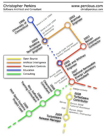
Christoper Perkins designed another resume using the common look of a subway map. Also it is visually original, but the connections between the different elements are not very complex (only two intersections between lines), so using the look of a subway map seems to add more complexity that it removes. Also this visualization uses intersections between lines to represent the fact that two events happened at the same point in time. But the fact that two work projects or education courses happened at the same time is probably not the most important characteristic of a resume.
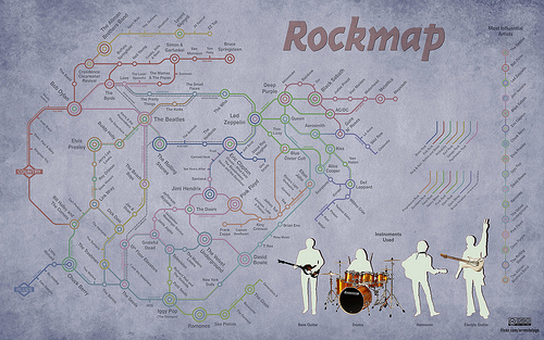
Compare this use of the subway visualization with the Map of Rock of Ernesto Lago. Here what is important is how some musicians merge two different styles, or inherit from two different musical schools or traditions, and that is exactly what the subway intersections represent.
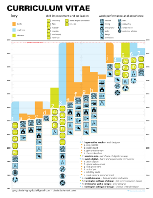
Greg Dizzia gives a different point of view. In his resume he adds the skills involved in each professional project. I think this is very valuable to potential employers, and it's one of the main points of a resume. In this case I think the visualization is a little bit too charged and repetitive but the main message is very well expressed.
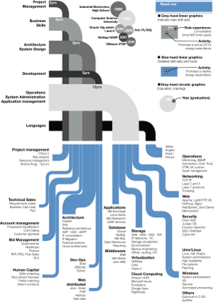
As a last example let's take a look at the resume of Gabriele Bozzi. In this case he forgets almost completely about the temporal element of the resume and concentrates on the functional areas. And he divides them between general skills, and knowledge of particular applications and tools. To me this has too much detail, and way too much keyword hunting, but the visual display is very interesting.
How to Make an Infographic Resume yourself
First of all, just like any other infographic project we need to decide what data we are going to show. In my case I will take short snippets of projects in which I have worked on. Because the main point of this post is to show how to develop the visual component I won't spend too much time in getting a great wording of each project, or using the correct keywords.
Second, it's necessary to decide what is the most important messages that we want to convey from that data. In my case these messages are:
- Education: I have a thorough education in Computer Science and Mathematics. It is not too varied because I don't have courses or certifications in other areas, and I studied all my degrees in the same University. But I have spent 10 years on it. Also, I don't want to add much detail about college projects, because they are less interesting than professional projects. And I don't want to mix education and work, because I combined both over the last few years and it would just look confusing
- Work: I have worked in some of the most prestigious companies in the world, in increasing degrees of responsibility and success and I definitely want to emphasize that. Also I want to mention that I worked in some particular areas in software, like machine learning. And I started doing a little bit of research lately. So I think it's worth showing that I am versatile, in terms of work skills. Finally I think it's also worth mentioning my contributions to open source and internships, because they add variety to my professional experience
- Impact: Finally, because I have been lucky to work in projects that are public and other people are using, I have had a significant impact outside of my employers. I want to emphasize that as well
And third, after the message is clear, it's turn to decide what kind of visualization would fit best the data and the message. I won't go very deep into this topic, because there is so much to talk about that we could fill several books. So here are the decisions I took:
- For the education I will simply show a bar with all the degrees that I have attained, in a straight line. The size of each part of the bar indicates how long it took to get that degree. The colors are only to differentiate sections. A legend at the bottom will indicate what is each section. Also as this is the weakest section, it will go at the end of the resume
- For the experience part, I will show a timeline of professional positions, and the main projects within those positions. I will add the logos of the corresponding companies on the left side. And for each project I will indicate the functional skills that I used. In order to keep it simple I will have only 5 main skills. Also to have space for all the positions, I will have a vertical timeline, instead of the most common horizontal one
- Finally, the impact of my projects is probably the most differentiating characteristic of my resume, so I will put it on top. And in order to show data that is easy to check I will use as a measure of impact the number of search results in google.com for the project name, divided by the number of developers in the project. In order to indicate which project corresponds to which value in the graph I will use an annotated time series.
And without any more delay, here is the result!
Impact
Clicking in each one of the marks in the time series highlights the description of the project. For each case I have included the employer, the position and a very short description of the project. In parentheses is the number of search results divided by the number of people that worked in the project. Also clicking in the description takes to a search results page. The results are usually a reference my personal work, or work in which I participated.
Experience
In the experience table I have added basically the same projects as above, but I have classified them by the main area of expertise. The link in each one of the projects point to search results, exactly the same way as before. It would have been also a good idea to point to a short description of the project. Initially I though about using color codes to indicate each main area of expertise, but this would add a little bit of duplication, because that is exactly what the columns mean. I think it is cleaner and more understandable without color coding the skills.
Education
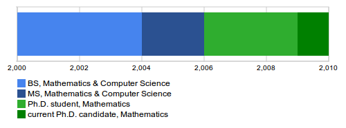
And finally, the education section. Here I decided to do a static image. The interactivity of the other visualizations wouldn't add anything. Also I used a similar color palette to the previous visualizations. Even though as it is there is no relationship with the visualizations above, I could have explored this idea further. Also I didn't add the university to avoid repeating the name four times.
Conclusion
To finish the post, I will repeat the core principles of how to make a good visualization:
- Collect the data to display, make sure its complete and precise
- Decide what is the most important message that you want to express
- Choose visualizations that convey that message but respect the data