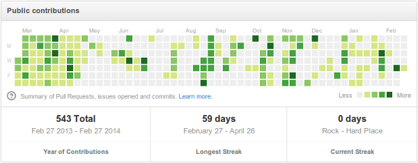
A github-like Activity Chart
One of my favorite features from github is the activity chart that appears in the user profile. For example, this one from user jmcnamara:
However, I don't really use github except for one of my older projects. In part because I prefer Mercurial over git. So I decided to write a small tool to generate these charts for my own local repositories.
There are two interesting parts. First, reading the change list data from Mercurial:
def extract_cl_counts(repository_path, cl_counts):
    """Reads the repository changelog and extracts CL counts per day."""
    repository = hg.repository(ui.ui(), repository_path)
    changelog = repository.changelog
    for cl_index in changelog:
        cl_id = changelog.lookup(cl_index)
        cl = changelog.read(cl_id)

        # The timestamp seems to be the 3rd field in the CL.
        # It's given in a tuple. The UNIX timestap is the first field.
        timestamp = cl[2][0]
        cl_date = date.fromtimestamp(timestamp)

        if cl_date in cl_counts:
            cl_counts[cl_date] = cl_counts[cl_date] + 1
        else:
            cl_counts[cl_date] = 1
And then building the chart itself, which seems surprisingly easy using SVG:
for day_index in range(first_day_to_show, last_day_to_show):
    # Boxes are stacked first by column and then by row.
    x = MARGIN + (day_index // 7) * DISTANCE_BETWEEN_BOXES
    y = MARGIN + (day_index % 7) * DISTANCE_BETWEEN_BOXES

    # Compute the real date from the day index.
    day = start_date + timedelta(days=(day_index - first_day_to_show))
    if day in cl_counts:
        color = get_box_color(cl_counts[day])
    else:
        color = get_box_color(0)

    chart.add(chart.rect(insert=(x,y),
                         size=(DAY_BOX_SIZE, DAY_BOX_SIZE),
                         fill=color))
And here is how it looks like:
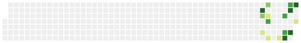
You can find the entire code of the chart script in Github (of course!)
Written on February 28, 2014