Edward Tufte, Presenting Data and Information
Last week I attended Edward Tufte's course on data visualization here in Seattle. For those who don't know him, Tufte is one of the world's top experts on information visualization. Here is a short description, from his website:
Edward Tufte has written seven books, including Beautiful Evidence, Visual Explanations, Envisioning Information, The Visual Display of Quantitative Information, and Data Analysis for Politics and Policy. He writes, designs, and self-publishes his books on analytical design, which have received more than 40 awards for content and design. He is Professor Emeritus at Yale University, where he taught courses in statistical evidence, information design, and interface design. His current work includes landscape sculpture, printmaking, video and a new book.
During the course Tufte made several observations that go against what some other people in the field recommend. The most notable from my point of view is to use visualizations with lots of content. And instead of trying to simplify the data, let people understand it on their own. I believe this can be appropriate in many cases, for example in an underground map:

However in some other cases the information overload hides what is really important. For example in this awful visualization in Forbes about where Americans are moving:
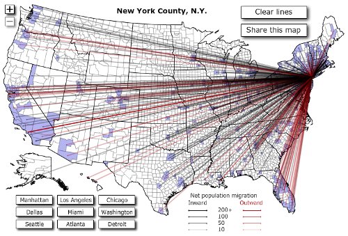
It's impossible to understand everything that is going on. What I got out of it is that people are moving from the most economically impacted areas (Southern California, Detroit, Miami, etc.) and into the least impacted areas (Pacific northwest, Texas, New York, Washington, etc.). Also I think I saw a minor trend of movement from colder areas to warmer areas. However with all that clutter it's hard to understand the overall picture. It is true that overload in general is a failure of design, not a problem with information, however it's definitely easier to make bad designs when one tries to present too much data.
In general the course was interesting, but for the most part it covered basic content. However they gave us a copy of Tufte's four books in visualization! Click on the following images to go to the corresponding Amazon pages:
The Visual Display of Quantitative Information