The Best Cities for Singles in America
A few weeks back I had a conversation with a friend about different places in the US where she was considering moving. And one of the factors was the dating scene in each one of those places. This brought to my memory a graph that probably many of you have already seen:
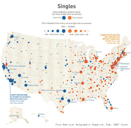
This map basically says the following:
- If the dot is blue, there are more men than women
- If the dot is orange, there are more women than men
- The bigger the dot, the greater the difference
However it has a series of problems. First of all, it's too dense. Second, it is not clear that the number of single men minus the number of single women (or the opposite) is what really matters, because obviously the bigger the city the less important the difference is. For example, in a city of 1 million we could have 100K singles and 20K more single men than woman. This means there are 3 single men for every two single woman. However in a city of 10 million, with 1 million singles, the fact that there are 20K more single men, only means there are approximately 1.02 single men for every single woman. It seems that the proportion of single men to single woman is more indicative than the difference. And third and most important, I didn't know for sure if the data in the graph is reliable, as there are no sources cited. So, as you can imagine I decided to check if there is actually any truth in this chart.
Here is the list of steps necessary to get the interesting data from the Census:
- Start in the Census fact finder homepage
- Click on Data Sets on the left navigation bar
- Select SF3 and click on Detailed Table
- In the Geography Type section choose Metropolitan Statistical Area
- Make sure all statistical areas are selected and click Next
- Now choose the table P18. Sex by marital status for the population 15+ years
- Click on Add and then Show result
From this table we want the "Never married" rows. Because the table is too big to analyze directly (280 columns) Let's download it and map the results using the Google Charts API.
You may need to clean up the downloaded file, because there are copyright notices and extra end of line characters. Also you may keep only the interesting lines, which are 3:
- The header of the table, which contains the name of the metropolitan areas
- The row for Male / Never Married individuals
- The row for Female / Never Married individuals
After removing all other rows, it's possible to parse the file and extract the interesting data with a small python script like this:
    input_file = open('DTDownload.csv')

    # First process the header line.
    header = input_file.readline()
    header = header[5:-2]  # Remove " ", at beginning and "\n at the end.
    tokens = header.split('","')
    cities = []
    for token in tokens:
        token = token.replace('MSA', '')  # Eliminate the MSA suffix.
        token = token.replace('CMSA', '')
        if token.find('--'):  # Remove everything after --
            token = token[:token.find('--')]
        cities.append(token)

    # Now process "Never married" men.
    line = input_file.readline()
    line = line[17:-2]  # Remove "Never married" at beginning and " at end.
    tokens = line.split('","')
    single_men = []
    for token in tokens:
        token = token.replace(',', '')  # Eliminate the , for thousands.
        single_men.append(int(token))

    # Now process "Never married" women.
    line = input_file.readline()
    line = line[17:-2]  # Remove "Never married" at beginning and " at end.
    tokens = line.split('","')
    single_women = []
    for token in tokens:
        token = token.replace(',', '')  # Eliminate the , for thousands.
        single_women.append(int(token))

    # And from those two quantities compute the ratio of single men
    # to single women. The higher, the better for women. Reverse the
    # quotient to get the other side.
    ratios = []
    for i in xrange(len(single_men)):
        ratio = float(single_men[i]) / float(single_women[i])
        ratios.append(ratio)

    # Now print the name of the city and ratio in the format accepted
    # by the Google Charts API, which is:
    #   data.setValue(0, 0, 'New York');
    #   data.setValue(0, 1, 1.064382);
    for i in xrange(len(cities)):
        print 'data.setValue(%(row)d, 0, \'%(city)s\');' % \
            {'row': i, 'city': cities[i]}
        print 'data.setValue(%(row)d, 1, %(ratio)f);' % \
            {'row': i, 'ratio': ratios[i]}
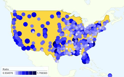
And to display the data, just include it into a Google Charts visualization. Unfortunately I couldn't figure out how to make the circles bigger or smaller based on one parameter and to set the color based on another parameter. Please tell me if you know how to do it. Anyway, until I find some time to learn Protovis, bear with me. What I did is split the chart into two, one for guys and one for girls. And to have it load faster, and avoid overloading with too much detail, I just took a small number of cities (This was actually Noha's idea so the credit should go to her). Here is how the chart looks like for girls, the bigger and bluer the better. It means there are more single guys for each single girl:
It seems that the West Coast, Texas and Florida are the best places for girls. Here is how it looks like when taking all 280 cities. I did not include the visualization, but a simple image because it takes quite a while to load.
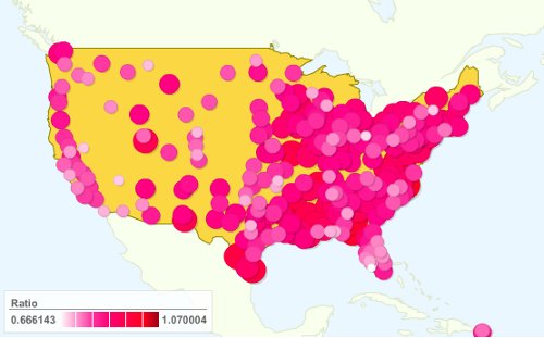
The one for guys is the opposite, the bigger and more pink, the better. It means there are more single girls for each single guy:
So the best places for guys seem to be the East Coast and the Great Lakes area. In particular the Bos-Wash corridor seems to be quite good. And here is how it looks like when taking all metropolitan areas:
Does anyone know of similar charts for other countries? I have never seen one myself. But after what we said before, if you can find census-like data now you can make one yourself!