Interesting Visualizations, Changes Over Time
Visualizations are simply ways of representing data. But if they are good, they can bring us deep insights, that go well beyond what is possible to understand by simply looking at the raw data.
There are several categories of visualizations, for example:
- Compare two entities based on a given set of metrics. An example of this is a benchmark between two competing companies or products
- Track the value of a given metric over time. A well known visualization of this type is a financial chart, with the value of an asset
- Compare the value of a single metric in different geographic locations. We have all seen maps in which the color of each region is based on the value of the metric
Another very interesting set of visualizations are those that allow us to track a particular situation over time. Here are three examples:
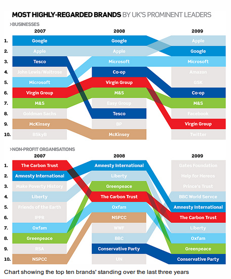
Tracking a change in ranking over time (by Ciaran Hughes)
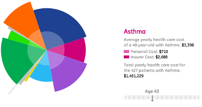
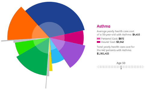
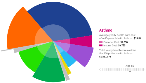
Tracking a change in distribution over time (from GE). The bottom slider changes the chart based on the age. Each section of the chart represent one kind of illness
Tracking changes in volume or magnitude over time (from xach.com). Each color block is a movie, and the size represents the box office in each week.
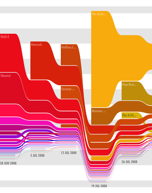
The first visualization doesn't attempt to indicate quantity because it displays an abstract concept such as brand appreciation. However in the third case the quantity is very concrete, the total box office in dollars.
We could use also the first or third approach for the second data set. But if we went with the first kind of visualization most likely we would only remember the most important expense for each age. Also we would be constrained in the number of years to show. If we decided to go with a visualization of the third kind it would be hard to compare how the expenses change relatively to each other as all of them are likely to increase over time.